CRO
An Arabic buy path with no overlap: one button from product to pay
Arabic checkout breaks when an English theme puts price on the left, the button on the right, and clipped copy. A new visitor in KSA or Egypt will not finish an order while hunting for Buy. One mobile path beats three equal buttons.
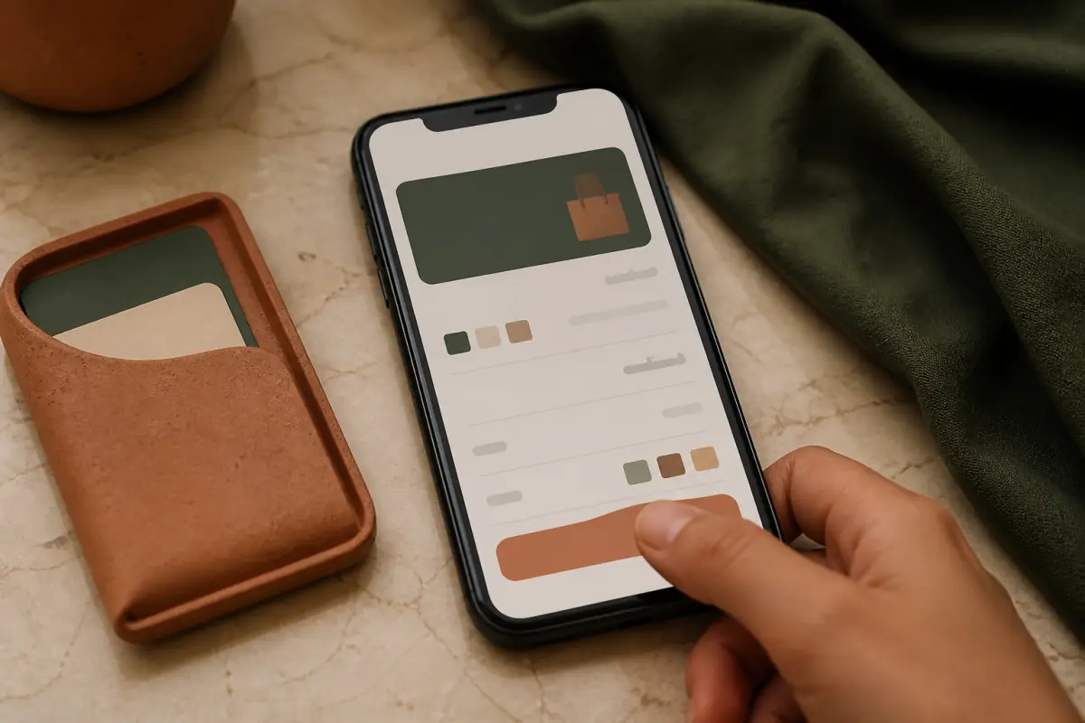
Arabic checkout is not a pasted English menu. It is page direction, field order, and button placement on a narrow screen. An LTR theme on an Arabic domain parks the icon on the copy, shrinks quantity below a thumb, and paints Pay too close to the background. The product can still be wanted. The tap still fails.
Overlap on Arabic checkout is friction, not decoration
A cart icon over the price, a discount badge covering size, a sticky header eating half the first screen. That is friction. You paid for the click. Then the layout fights the shopper.
The visual scan at x8x reads a mobile screenshot: contrast, button names, and order from right to left. The report does not say the design is pretty. It says whether Buy is visible and whether the copy is readable.
If a thumb cannot find Buy on the first screen, the ad is burned. A coupon does not save a button hidden under a floating chat.
Fields smaller than a thumb
Quantity, size, and coupon need a usable tap target. Many themes inherit desktop controls. On Android in Cairo or iPhone in Riyadh the shopper double-taps by accident, raises quantity, or opens Share instead of Pay.
Increase space between Buy and Share. Keep Share as a secondary icon, not a button as wide as Pay. Review one CTA for higher conversion before you add more widgets.
Contrast and ready-made theme colors
Gold on beige, or white on a yellow sale, is common in Eid themes. Fine on a banner, risky on the button. Contrast is not taste. It is reading in sun on a weak network. If the scan shot looks washed out, change the button color before you change price policy.
Shift during load misses the tap. An image without dimensions pulls the price down and the thumb hits another row. Read CLS on web.dev to see why a stable layout is conversion work, not polish.
One path from product to cart to pay
If Buy, WhatsApp order, and Share sit in the same row, the shopper splits. Pick one primary action above the fold. Keep the rest secondary, lower or in a menu.
In Egypt and KSA, WhatsApp ordering is common. Decide: either on-site pay is primary and WhatsApp is a text link, or WhatsApp is primary because manual confirm is the model. Equal size means half the visitors leave for chat and half open an incomplete cart.
Then unify checkout: order summary, address, shipping, and pay without a jump. Extra steps with no reason break mobile. Account creation is optional. Forced signup before address is a known loss.
- Product page: price, size, one primary button.
- Cart: change quantity and remove a line without a full reload if the platform allows.
- Address: Arabic fields, city and district, RTL labels.
- Shipping: clear rates for KSA cities or Egypt governorates, no surprise on the last step.
- Pay: visible gateways, and an Arabic error if the card is declined.
Address and pay fields in Arabic
Name, mobile, city, district. An English theme puts postal code before mobile, and left-aligns the phone. Paste from chat lands wrong, and the confirm SMS never arrives. Set the field type for phone, and keep the label on the right.
Card brand and CVV boxes in English are fine. Error copy must be Arabic. A raw declined line with no explanation makes the shopper think the site is a scam, not that the bank said no. Transport trust and the lock in the browser sit on the same path.
Salla, Zid, Shopify, Woo
Salla and Zid ship hosted pay steps. The theme still breaks what happens before pay: product and cart. Shopify checkout is hosted, but product and cart live in the theme. WooCommerce pay plugins add extra buttons (Apple Pay, Tamara, Tap, Mada) with no order. Rank gateways by country: Mada in KSA, cards and Tamara if enabled, Vodafone Cash or wallets in Egypt if that is the model.
Do not add a gateway for decoration. Each extra button is another choice on a small screen.
Test the page the way a shopper does, before you raise budget
Scan the URL, read the mobile shot, and if the buttons are unclear, fix direction before ads. x8x scans the store and ships speed, UX, and build work. A screenshot is cheaper than a week of ads on a broken path.
Test on a real network: ad to product, to cart, to pay. Note where the shopper stopped. Often size, shipping, or a floating button over pay.
- Hide chat on pay steps, or move it after purchase.
- Shrink the sticky header on mobile so price stays visible.
- Write Buy now or Pay, not a broken translation of submit.
- Show the total with shipping before you ask for the card.
- Put the return policy next to the button, not on a distant page.
Speed is part of the same path. A clear button on a slow page still loses. Read store speed and lost sales if the shot looks fine and the load does not. Visibility matters too: a search visitor lands on the product and expects a clear button. Product page SEO brings the visitor. The Arabic path closes the order.
GCC and Egypt: different expectations, one rule
In the UAE and Kuwait, cards and wallets are common. In Egypt a large share prefers transfer or WhatsApp. In KSA, visible Mada and installments raise trust. The rule is the same: one primary action, RTL fields, a stable summary.
Do not clone a famous English theme and swap the logo. Direction, type, and buttons need a buy-path review. If the theme fights RTL, the fix is deeper than two lines of CSS. Then theme versus build is clearer after a scan.
If the screenshot is in front of you and buttons overlap or pay is still LTR, a WhatsApp consult can sequence the path fix before a new campaign.
Ship the full path, not only home
Home sells the brand. The order happens on the product. Fix product, cart, and pay as a set. After the work, scan the same URL again. Confirm the button is not covered after a new pixel or chat app.
Start with a store scan. Without a shot, the debate is taste. With a shot, the debate is tap target, contrast, and order.
A short launch checklist for the team
Before a season, walk three products, cart, and pay on a real phone. If the Arabic name clips, the total sits on the left for no reason, or back from pay empties the cart, do not run the ad. This repair is faster than a new creative.
Document which gateway works in each country. An ad that promises installments while the page has no Tamara or Tap breaks trust on the first pay screen. The buy path is a promise, like the title in search.
Frequently asked questions
Should WhatsApp be the primary button, or on-site pay?
Choose from how the store runs, not from the theme. If orders are confirmed by hand in Egypt, WhatsApp is primary and pay comes later. If pay is instant in KSA, Buy is primary and WhatsApp is a help link. Do not give both the same size.
Is a CSS direction flip enough for Shopify themes?
Sometimes for copy, rarely for forms and icons. Cart and pay need field tests. If icons mirror and meaning flips, CSS alone is not the fix. Edit theme blocks or replace the section.
Why do shoppers add to cart and never finish?
Often late shipping cost, forced signup, a low-contrast pay button, or a layout jump. Walk the steps in order on mobile. A surprise discount on the last step causes more exits than a discount shown from the product.
Fix the product first, or the pay gateway?
Fix what blocks the first tap: button, size, and direction on the product page. After add-to-cart rises, review the gateway and Arabic errors. A gateway fix on a broken product path is never seen.